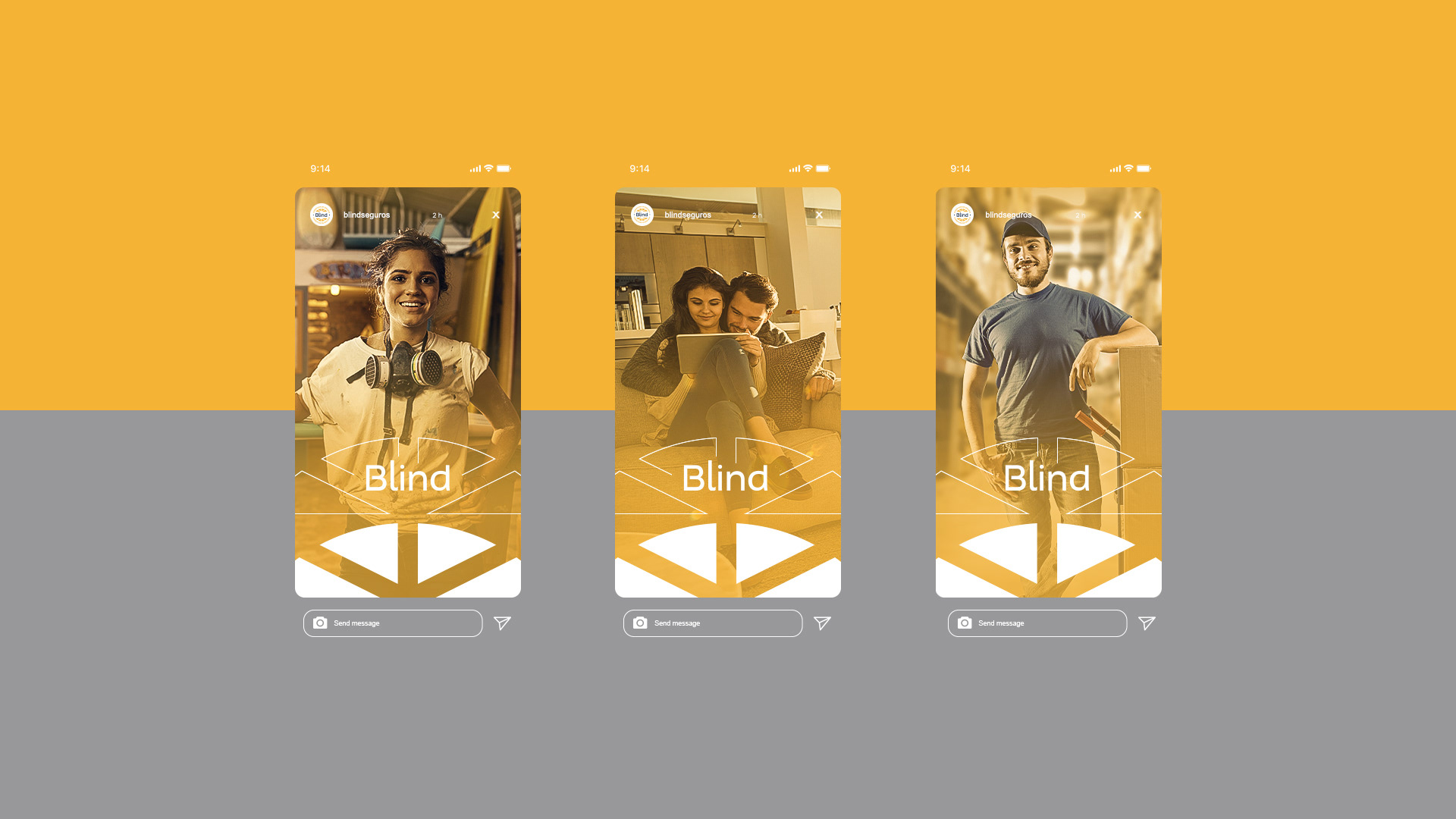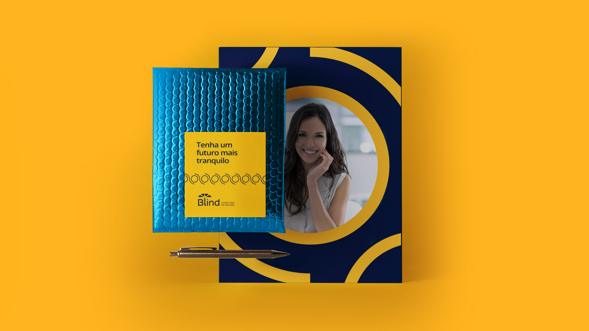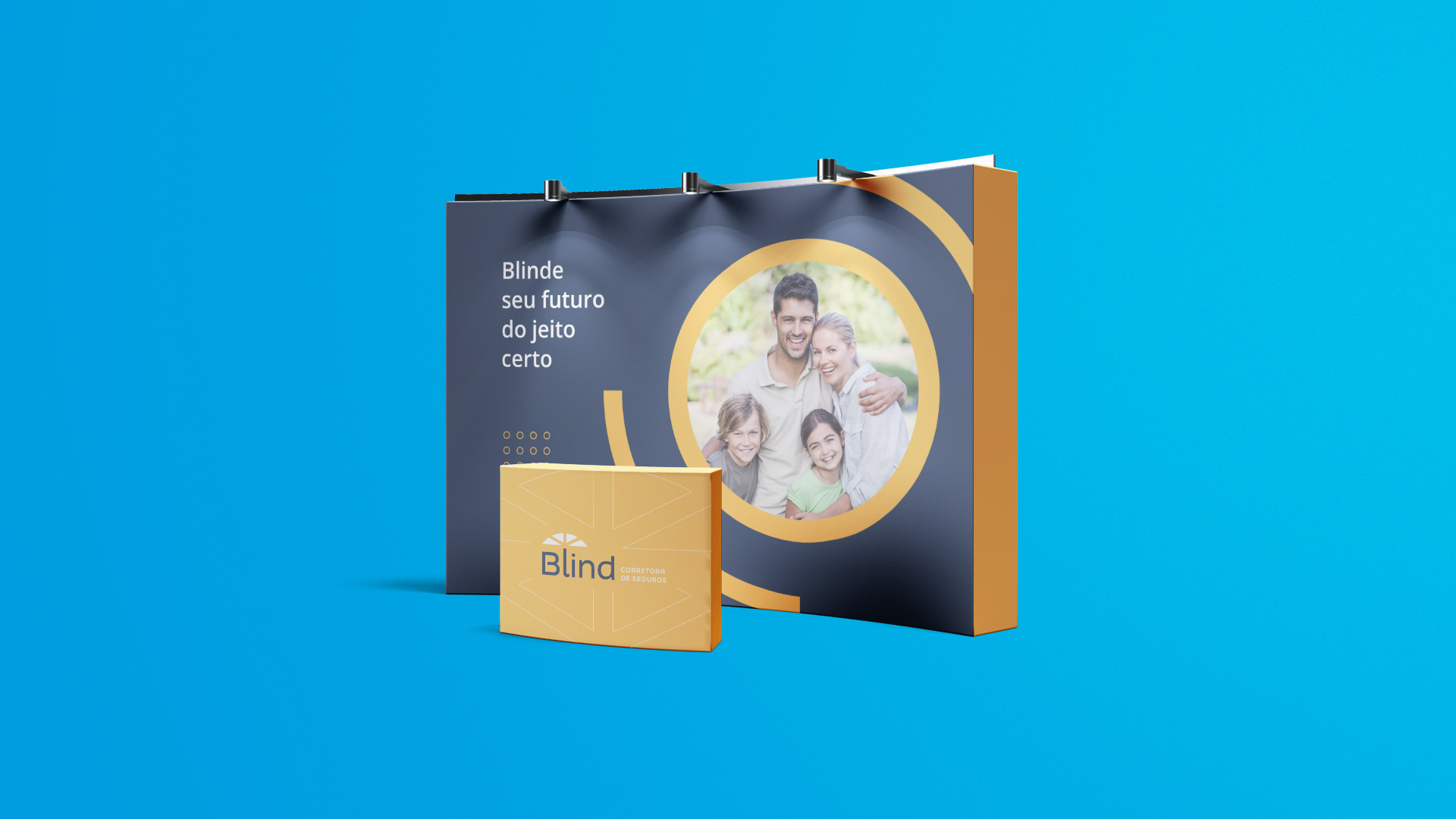


Briefing
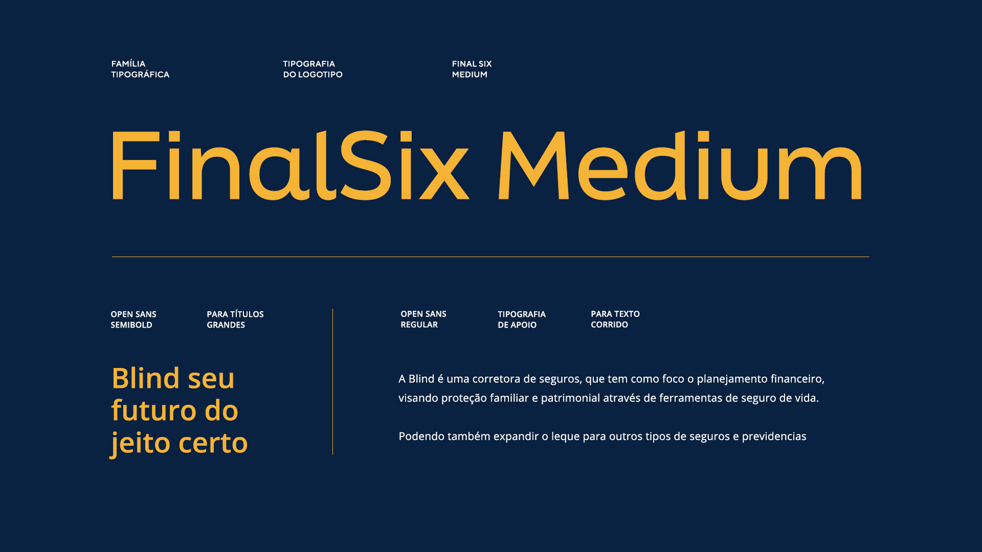
Blind is an insurance broker, which focuses on financial planning, aimed at family protection and property, through life insurance tools.
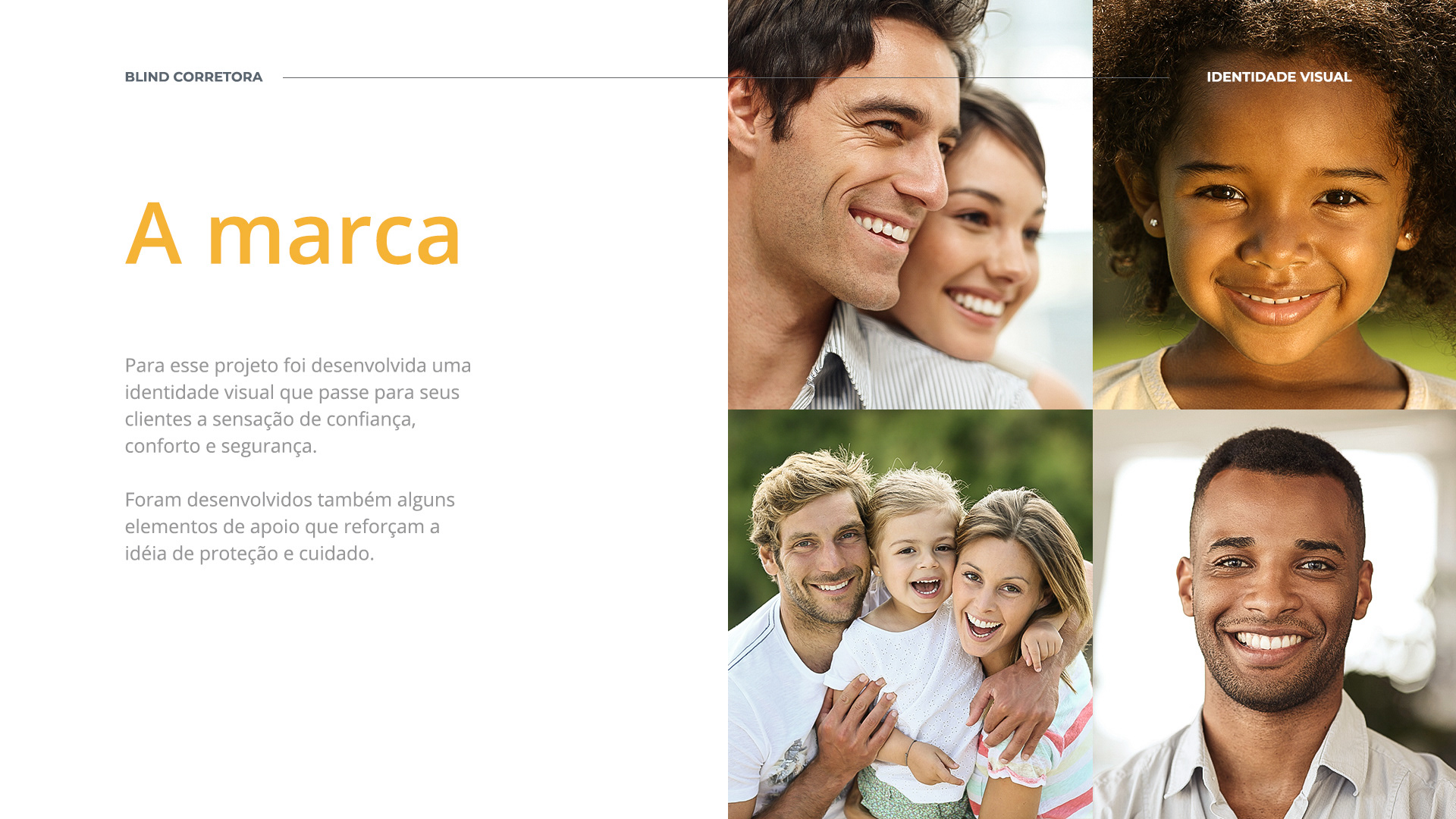
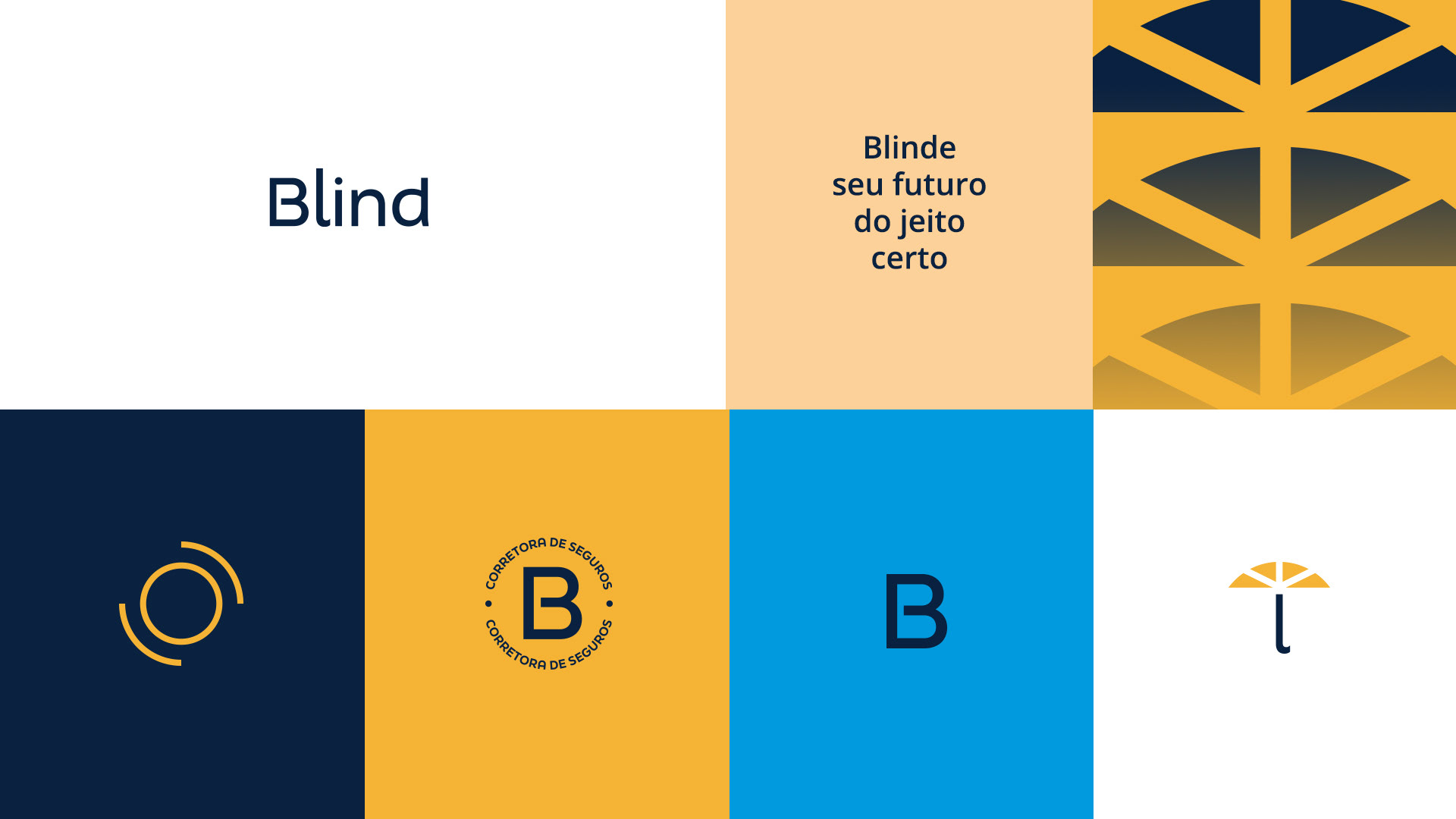
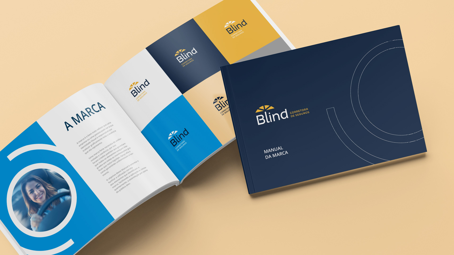
The brand
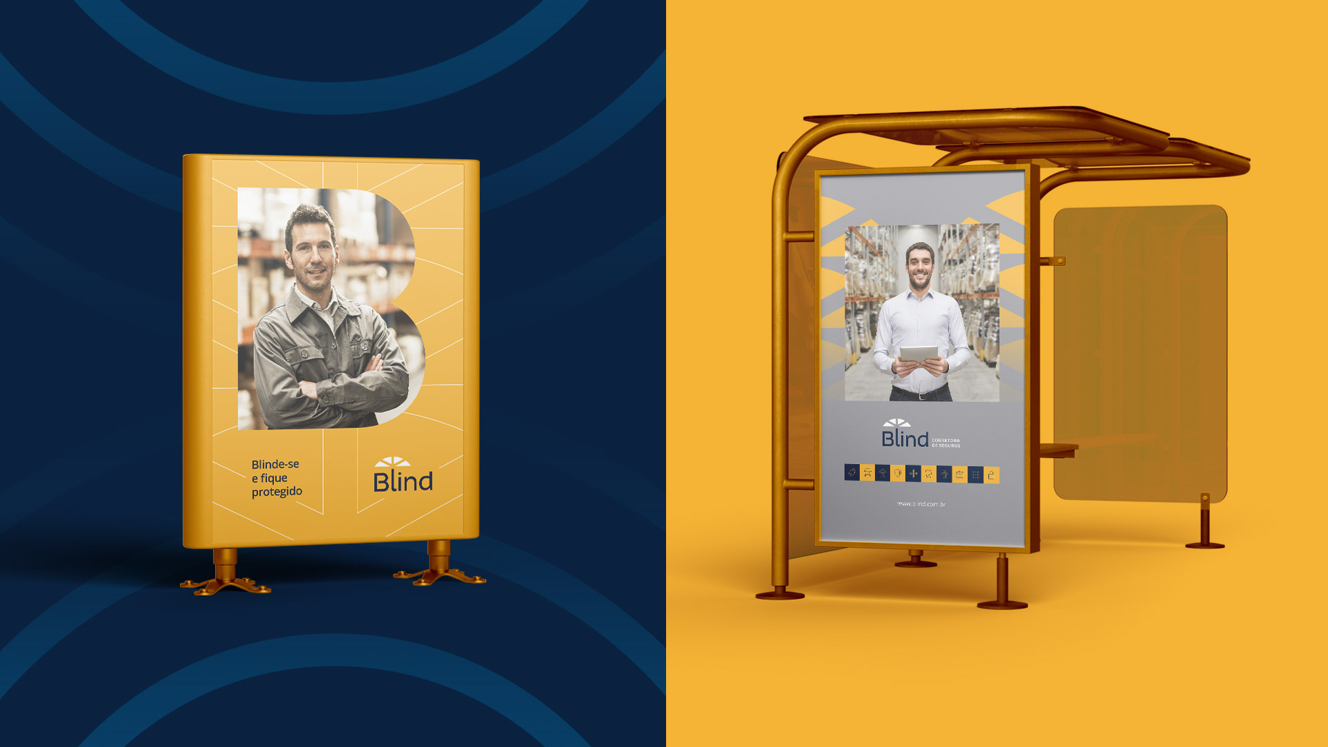
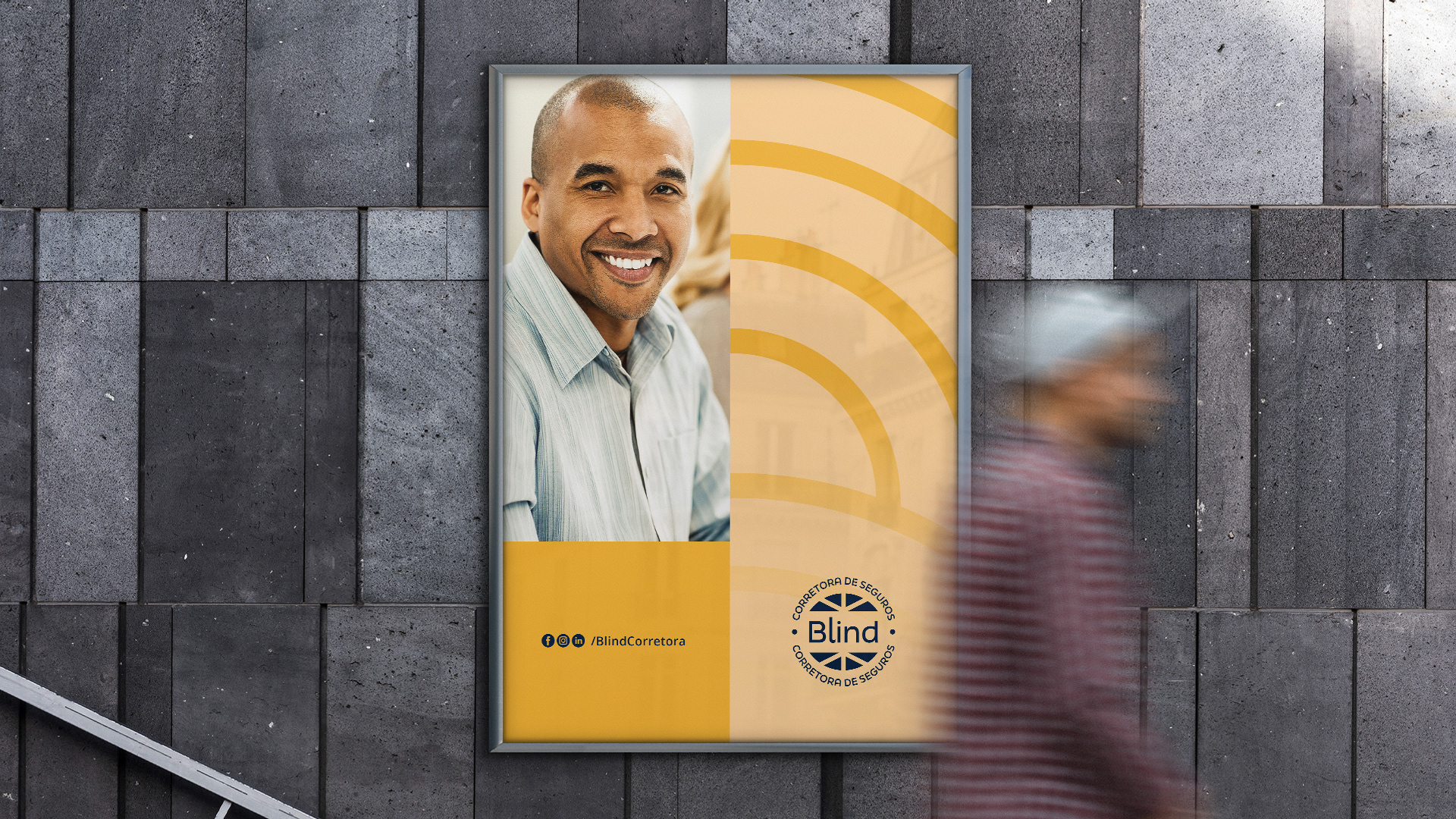
For this project, a visual identity that passes to your customers the feeling of confidence, comfort and security.
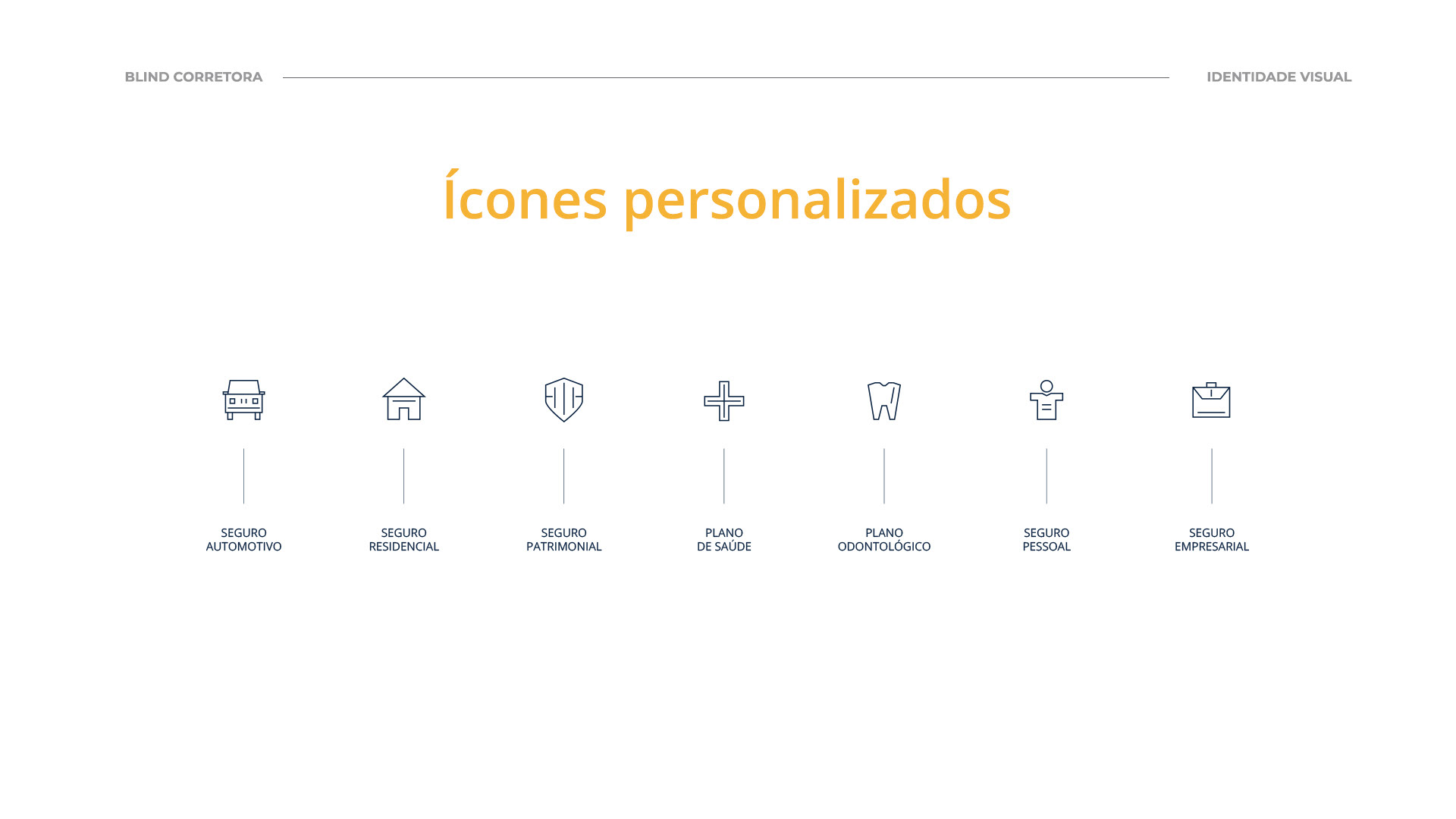
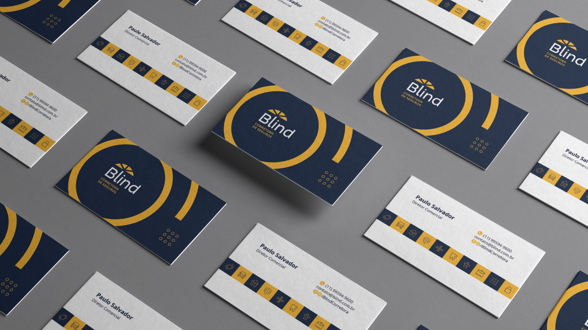
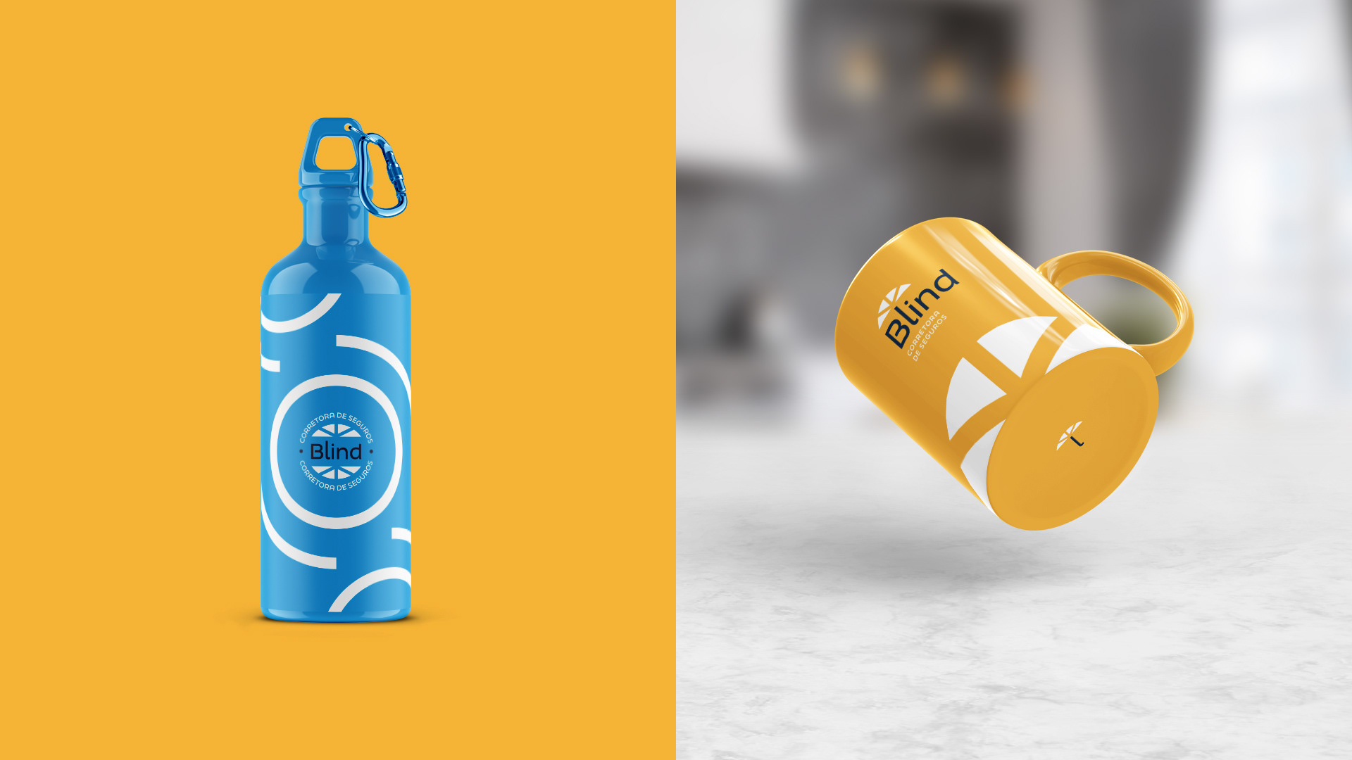
Some support elements were also developed that reinforce the idea of protection and care.
Words key to the concept
WOULD BE | CONSERVATIVE | DELICATE | SENSITIVE | CURRENT | STABLE | ELEGANT | MODERN | REFINED
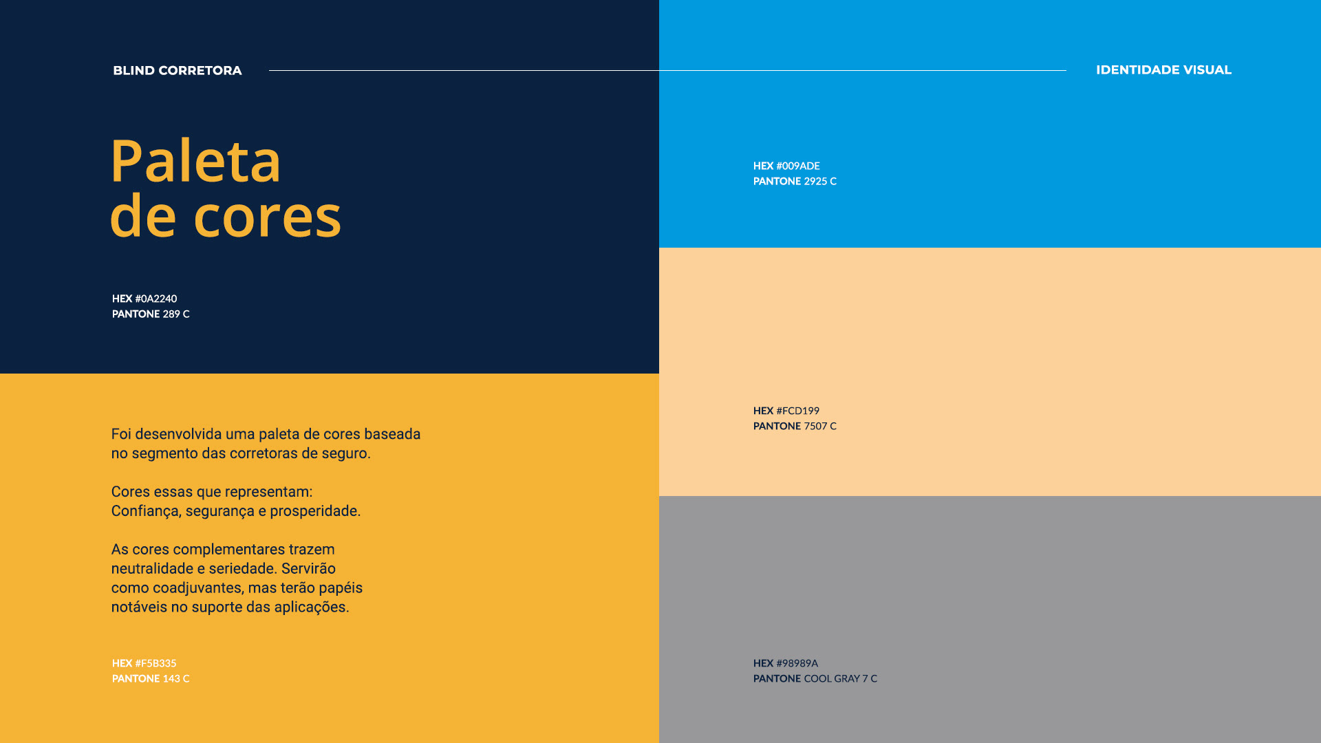
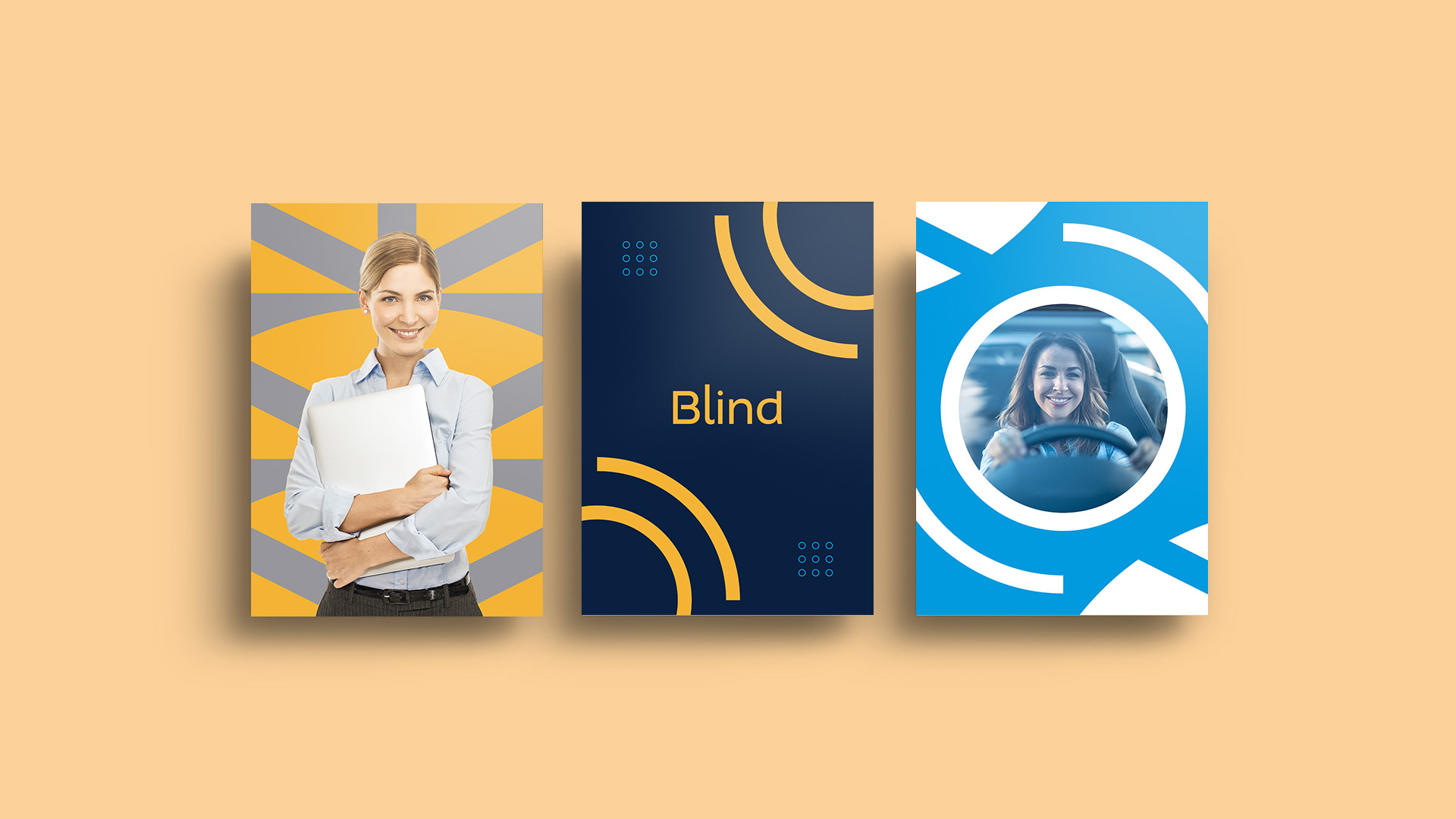
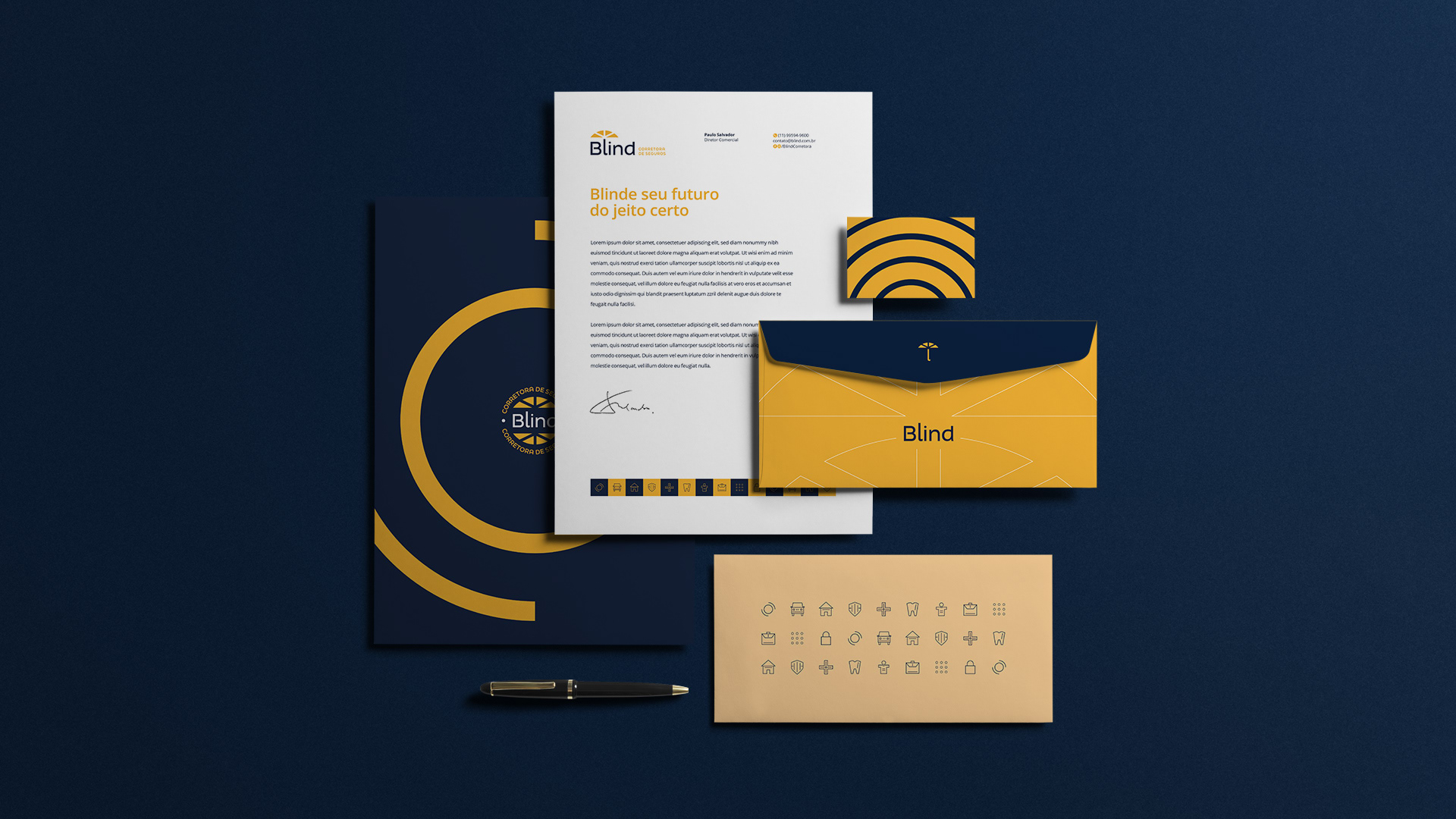
Color palette
A color palette was developed based on in the insurance brokerage segment. These colors represent: Trust, security and prosperity.
Complementary colors bring neutrality and seriousness. will serve as supporting actors, but will have roles notable in application support.